Creative Direction
GAP EVERGREEN ICONS
Art Direction: Roxanne Zargham
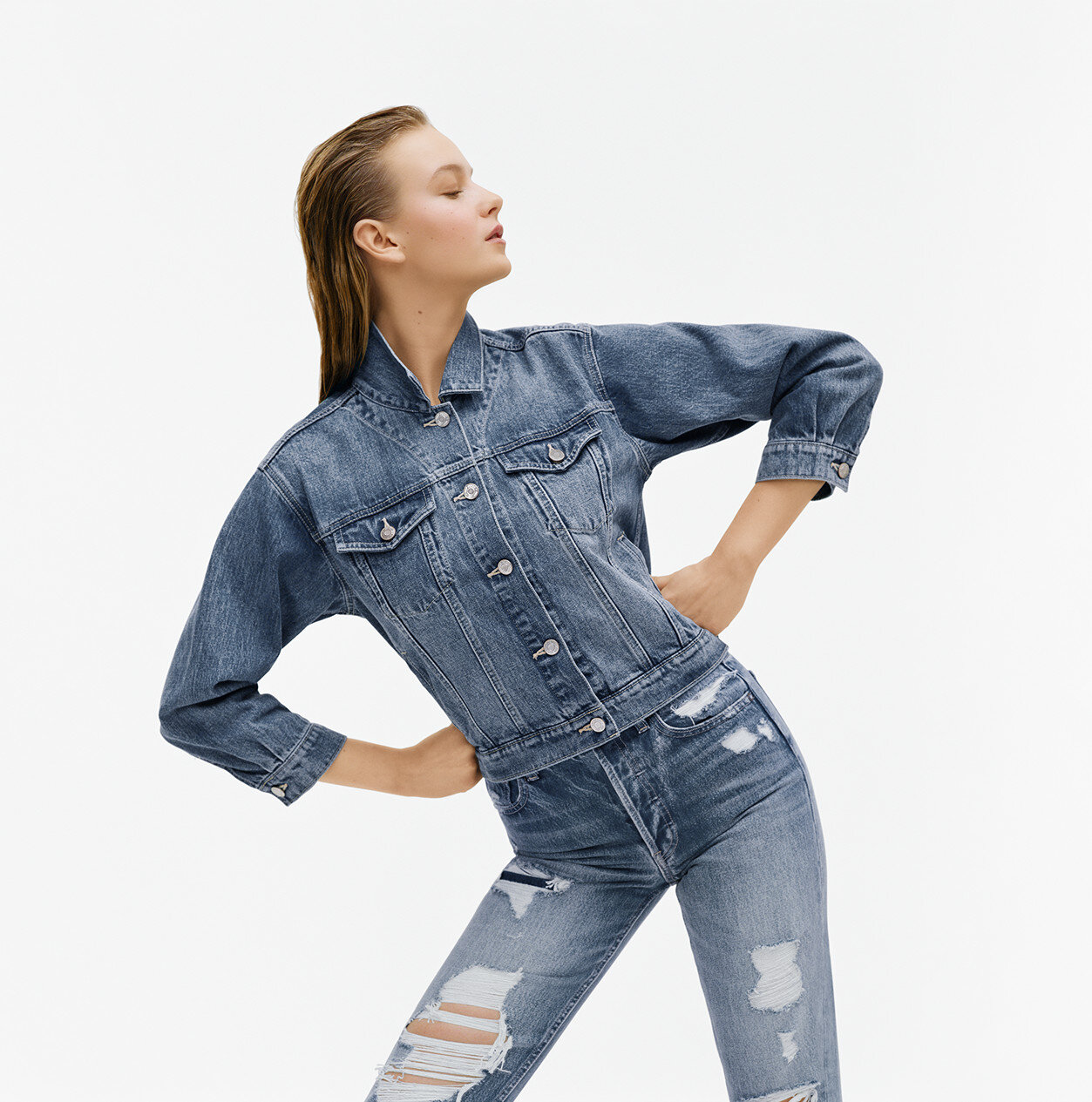
When I arrived at Gap I noticed the stores were chaotic with product and visual displays. I wanted to come up with a solution to clean the stores up and make them organized and simple. Gap has always been an image led brand, and I wanted to get as many images into the stores as possible. I created a system of iconic evergreen images that were designed to run around the top portion of the stores to create a billboard of images that could stay up as long as needed. The images were broken up into denim, khaki, and sweats, and coordinate back to merchandising of the sections of the store. For the still-life images I deconstructed gap garments and used small props like buttons, thread, and trims that speak to the quality and construction of the product.


